
Logo and Branding
Electric City Physio
Context
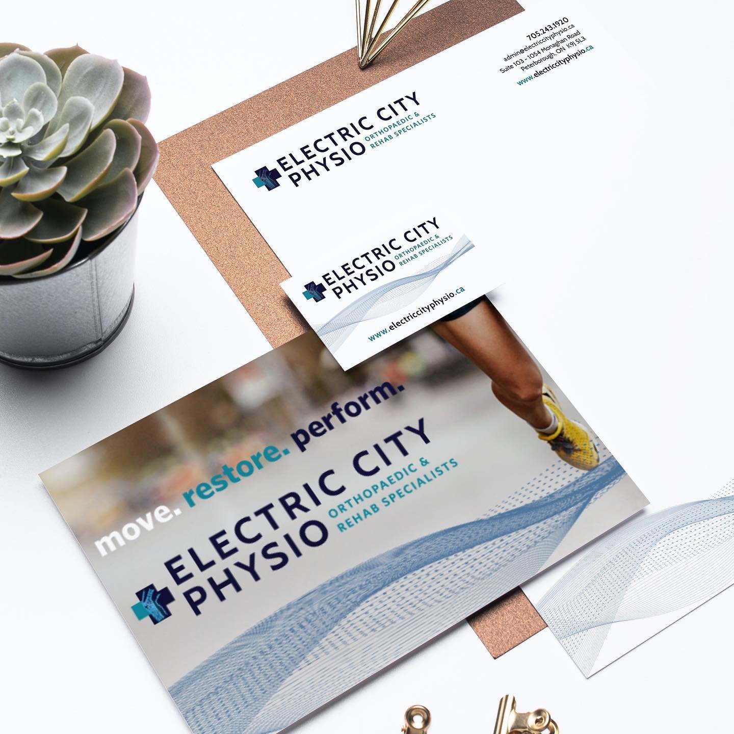
A new state-of-the-art physiotherapy and sports medicine clinic approached us as they required brand development. Collateral in the project brief included: a logo, brochures, interior and exterior signage, custom wallpaper for the waiting room, gift cards, letterhead, business and appointment cards, website graphics, billboard advertising, Google advertising, social media, and ongoing design support.
Logo Details
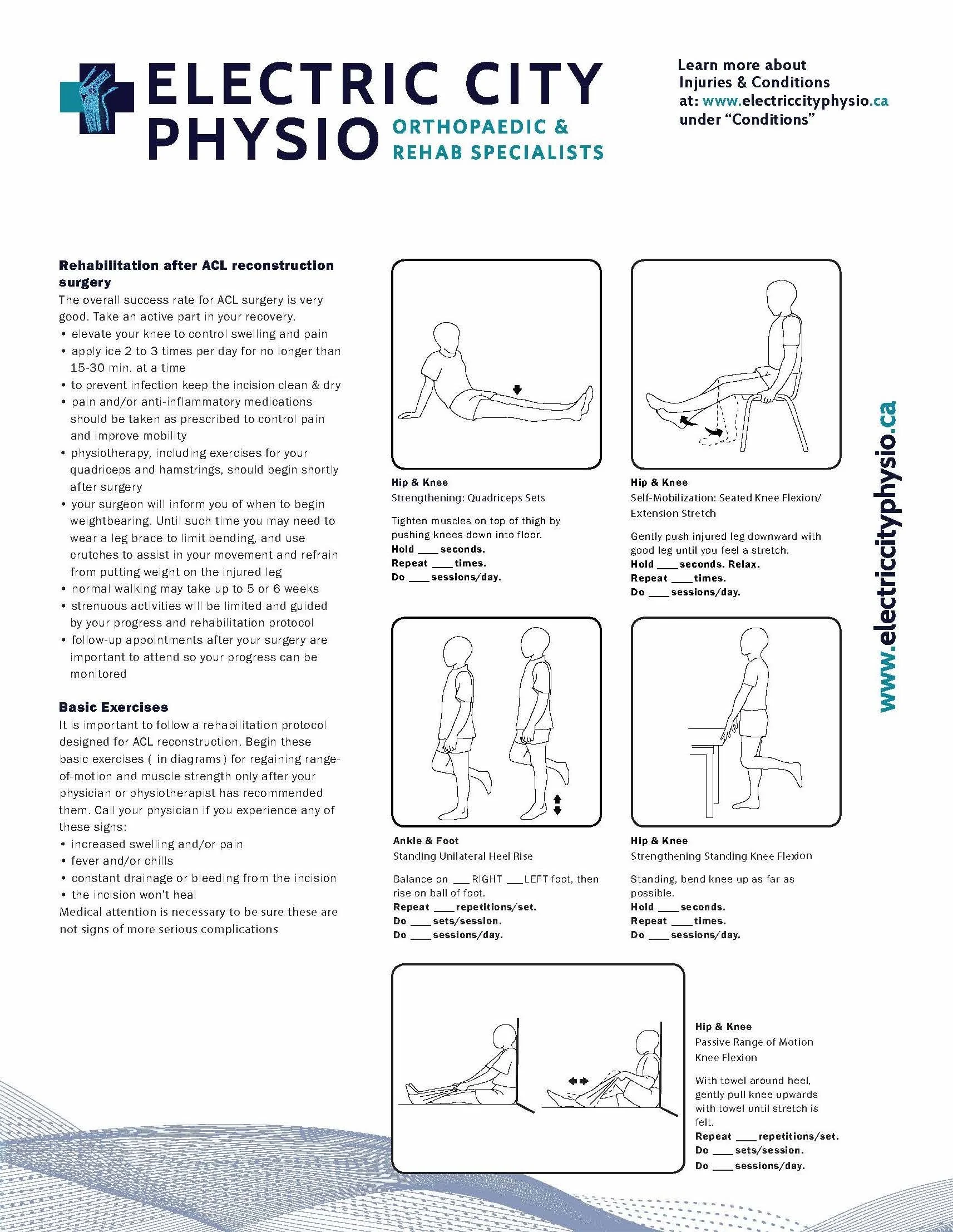
The process involved including details distinct to the client, such as the knee joint within the medical cross representing the clinic's specialization in rehabilitation for Orthopaedic Surgery patients of Dr. Dobson, M.D., FRCS (C).
Branding
Concept exploration involved developing the technical information gleaned from the research process and approved by the client. The overall design process included working closely with the interior designer to ensure the colour / aesthetics were cohesive between the branding and the interiors of the clinic, from the custom wallpaper design to the signage placement. Additional details spoke to the muscular-skeletal nature of the work occurring at the clinic. The woven pattern mimics the fibres of muscle and flows across materials to represent movement and progress, speaking to the client’s tagline: Move. Restore. Perform.

Collateral
A special circumstance arose a few months after the completion of collateral with the Ontario College of Physicians determining that the clinic's name needed to change from Electric City Physio Orthopaedic and Rehab Specialists to Electric City Physio With Orthopaedic and Rehab Specialists, requiring a re-imaging of the logo. We found a way to subtly make the change to appease the College yet ensure that the clinic did not need to change all the branded materials and signage, which would have resulted in a substantial cost outlay.
The clinic emphasis is on sports medicine, with branding needing to appeal primarily to an audience of athletes. We reviewed colours and how particular colours are associated with medical, and the intensity of athletics. Additionally, we were informed by the client due to having an Orthopaedic Surgeon on staff, there would be a large population of elderly patients, requiring brand colours and font choices to be accessible.