

Brand Development and Collateral
North Hastings Hospital Fund Development
Context
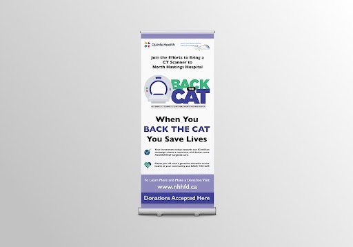
North Hastings Hospital Fund Development required a re-branding, including logo; print materials such as educational rack cards, letterhead, brochures, thank you cards, presentation folders and leaflets; website; and ongoing graphic design support for their fundraising campaigns.
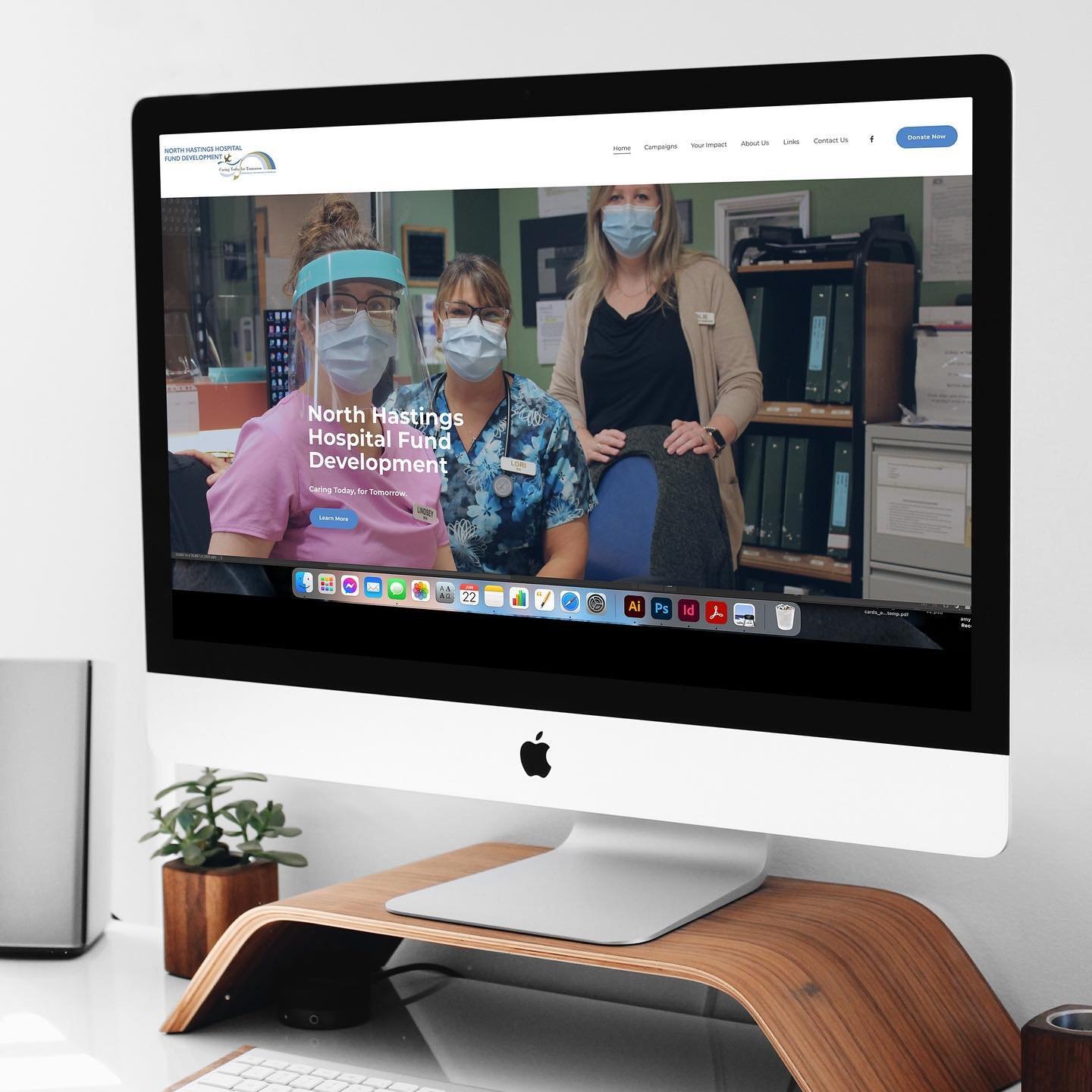
The greatest need was a website that would be visually appealing and fundraising forward: clear communication of fundraising goals and clear paths to educate community members and foundations on how to make donations or get involved.

Branding and Website Design
We began by laying out each project phase: the initial phase was the brand guidelines and logo, as the foundation had been operating with outdated and blurry logo files, which we tackled in a complete revisioning and proper file execution; phase two was the development of font and colour guidelines; phase three was the framing of the site, being a ground-up rebuild as the website was not meeting updated code or UX principles. With the branding guidelines, logo, and website completed, the fourth and final phase of additional collateral began, developing the designs from the foundational pieces established in the first three phases.
A brand package was created and made accessible to the board members, the branded website was published, board members received training about writing blog posts and maintaining the site, and the various collateral printed.


Results
The website has clear fundraising goals and an easy path to donations. (The foundation can update the website as they desire, although they have chosen to return to us for updates and additional pages.)
The most satisfying qualitative evidence is that with the resulting re-brand and thoughtful design of materials, the foundation has successfully fundraised toward a new CT scanner needed at the hospital.